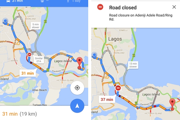
Google Maps in Nigeria has added a feature that shows traffic conditions in real time. These conditions are represented by three colour codes: Green, Orange and Red.
Green means the road is free; orange means the traffic is not so bad; and red means, well, that the traffic is ‘5pm-on-Lagos-roads’ bad.

Here’s how it works. Google analyzes data transmitted by the GPS locations on people’s mobile phones. The mobile phone location has to be turned on for this to work. Google then generates the live traffic map by calculating the speed of users along the length of the road. Raw data from the mobile phones are processed and “anomalies such as a postal vehicle which makes frequent stops are excluded.”
However, this feature is limited. If the large number of people going to, say Ikoyi, at a particular time are not connected to the internet or do not have their mobile phone’s GPS turned on then the overlay would be green. And that would not be an accurate representation of the traffic condition of that road if it were congested.
In other words, the traffic data is only as reliable as the amount of people using Google Maps at the time. Therefore, the fewer the number of users the lesser the quality of traffic prediction.
The changes in the way the map is being rendered is not limited to Nigeria. The same has been noticed in Nairobi, Kenya.
Google isn’t alone in this. Microsoft is also working on its own Traffic Prediction Project. Microsoft will work with select partners and the aim of the project is to be able to predict traffic “up to an hour in advance.” It will make use of data from Microsoft’s Bing traffic maps and the social networks of drivers.
It’s important to note that all this is based on participation of the mobile phone users, so both Google and Microsoft’s traffic predictors cannot function well without their permission.


